In 1930, Emily Post wrote, “In its brightest tones, red is the most brilliant, stimulating, and approaching of all the colors.”

Red is one of my all-time favorite colors. I am starting to get in the mood for Valentine’s Day so I could not resist a vivid red tablescape this week. I started with a crimson tablecloth (Crate & Barrel) which I received as a gift from a dear friend a few years back (thanks Kim!). The placemats, napkins, and red beaded napkin rings are from One King’s Lane. The placemat and napkin set is Couleur Nature designed by Bruno Lamy. His signature Provencal designs have a touch of whimsy and feature various floral, fruit, and fauna prints (you can find more patterns at www.couleurnature.com).


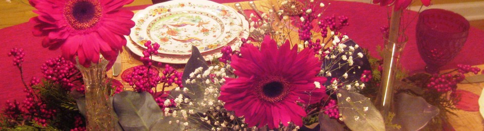
For my place setting, I selected a set of four vintage plates by Copeland Spode with birds and floral and red trim, Pattern 2/5813, circa 1913. I love the beauty and vibrance of the plate’s colors. (Back Marks: In black, Rd. No. 494242, Copeland, Spode, England and Maple & Co, London; Hand numbered in red; Impressed mark of a crown and the word “Copeland”). The stemware is vintage Villeroy & Boche Boston Red (Ruby) Claret Wine glasses (eBay). I am very fortunate that my husband’s grandmother passed down to us this beautiful, timeless, sterling silver set which I love. It is 1942 Watson Sterling Silver Windsor Rose.


For the centerpiece, I chose a faux holly berry swag which I brightened up with a few red votives and a set of 3 small crystal vases-each with a single red gerber daisy and a little baby’s breath.


Now I just need to invite some folks over for dinner to enjoy this table!

I am a big, big fan of all the color!!! It’s so energizing!!! Red comes in so many different hues, and this is one that I particularly like. It has a pinkish undertone that really appeals to me. Beautiful silver, too!!! I immediately noticed how the pattern travels the length of the handle. Very nice!!!
Red is one of my all-time favs, too! Great inherited pieces!
Love all the red! I’m a big red fan too! Your dishes are lovely and your gerbera daisies are a cheerful touch! Your V & B stemware is a treasure too!
This is really beautiful! I love the Spode and red just makes everything pop. Think the flowers truly make this tablescape. Great job!
What a stunning table! I love the placemats and napkins you chose to highlight the gorgeous china! I also enjoyed reading that you’re using family silver — such a treasure! And I always am drawn to red stemware — so pretty!
Beautiful table! Gorgeous plates and stemware.
Beautiful napkin rings! And placemats and your dishes.. The table is simply spectacular. xo marlis
Great color, china pattern and napkins rings are to love. Eye-catching tablescape.
Did I see snow outside your window? So pretty.
Yes, I do love those napkins and napkin rings. Red is one of my favorite colors, and this is just soooo pretty!!–Betsy
This table is so right up my alley! I am enchanted by the Bruno Lamy. I’ll follow up on the resource. I, too, am a fan of Copeland Spode…lovely. Thank you for inviting us for a peak. Cherry Kay